

State management in React is one of the most hard-to-grasp concepts, especially for newbies trying to pick up the Popular JavaScript framework, and understandably so. Managing states has been such a headache that several state management libraries have been dedicated solely to making state management easier. Redux is the widely used solution and this wholesome tweet contains one of the most brilliant explanations of how Redux works.
However, today is about how forms are created, managed, and styled in React. This article assumes that
- You have a fundamental knowledge of React and JSX
- You understand how controlled forms work (optional)
- You want a trusted way of handling forms in your React projects.
It is worth knowing that the official React documentation recommends using Formik and other forms management solutions for form management as managing forms can get confusing fast. We will be looking at Formik, which has detailed documentation and how it pairs well with Yup.
Formik solves the problem of managing forms state in React by providing several APIs that helps make forms easy to manage, like:
- onChange: What happens when values are typed in a particular form input.
- onSubmit: what happens when the user submits the form.
- onBlur: What happens when the user brings a form input into focus and then out.
So how does Formik handle these parts?. Let's find out by creating a single sign-up form. Our sign up form will take the following data from the user
- username
- password
- password confirmation
REQUIRED PACKAGES
This task requires the following packages
- Formik (for form management)
- Yup (for validation) To quickly get up and running, we will set up the project by using Create React App.
USING CREAT REACT APP
To set up our project, we will have to run the npx command for Create React App
npx create-react-app [name of folder]
For this project, we are going to name our folder, signup_form. Therefore, navigate to any location of your choice (desktop maybe) and then in your favourite editor's terminal, or command prompt, run the following command:
npx create-react-app signup_form
This should create the skeleton react app structure with the neccesary set up. Upon completion, we navigate into the folder using cd signup_form. Just to confirm that everything worked as we hope, we run
yarn run start
This should open a sample React app on PORT 3000 (if no other application is not currently using that port).
INSTALLING ADDITIONAL PACKAGES.
To install our previously mentioned packages. This required stopping our app, this can be achieved using
CTRL-C on windows or CMD-C on Mac. Then we run
yarn add yup formik
or if you are akin to CSS-in-Js, you can add styled-components, by running
yarn add yup formik styled-components
but we will be utilizing CSS modules for this project.
CREATING THE FORM COMPONENT
Now let's create the form component, remember the form takes four inputs
- a username
- an email
- password
- a confirmation of the password.
In our src folder, we
- create a
componentfolder.
Then inside it, we
- create a
signupfolder
that will contain two files
- SignUpForm.js
- SignUpForm.module.css
The content of our SignUpForm.js component after the necessary imports look like this:
import React from "react"
import { useFormik } from "formik"
import * as yup from "yup"
import styles from "./SignUpForm.module.css"


const SignUpForm = ()=>{

    return(
        <>

        </>
    )
}
CREATING A REUSABLE INPUT FORM COMPONENT
Since the input fields will look the same except for smaller changes, it will be both time-saving and efficient to create a component that can then be reused all over our application.
The component looks like this:
const FormInput = ({
name,
labelName,
placeholder,
type,
onChange,
onBlur,
value,
errors,
touched,
}) =>{
    return (
      <div className="mb-1 sm:mb-2 w-full ">
        <label  htmlFor={ name }>{ labelName }</label>
        <input
          placeholder= { placeholder }
          type= { type }
          id= {name}
          name= { name }
          onChange= { onChange }
          onBlur= { onBlur }
          value= { value }
          className = {errors && touched ? `${styles.animated} ${styles.shake} ${styles.redborder}`:null}
        />
      </div>
    );

}
This component will takes the following props
name: Name of the input that refers to how it is received on the server (assuming we are submitting to the server)
labelName: for accessibility, we must provide a label for all our forms.
placeholder: placeholders are important as they provide cues for the user, giving them an idea of what should be in particular form input.
type: refers to the type of input, this can be text, email, password. This is basic HTML validation.
onChange: this refers to a function that is triggered upon a change in the value of a particular input field.
onBlur: this refers to a function that is triggered when an input form comes into and then out of focus.
value: the value associated with a particular input field, used in tracking the state of that input.
errors: an error that results from the validation of the input field, the validation is performed by the validation function defined in the useFormik.
touched: a boolean that indicates if a form field has been visited. Controlled by the onBlur function.
VALIDATION ERRORS
In order to display our validation errors, we have an additional component, called Validation
const ValidationError = ({touched,errors})=>{
    return(
        <div >
            {touched && errors ? (
            <div className="text-red-500 mb-2">{errors}</div>
            ) : null }
        </div>
    )
}
The validation component takes the following props:
- errors: This is the same as the error resulting from the input field validation.
- touched: This is the same boolean that indicates if a form field has been visited.
BUILDING OUR MAIN COMPONENT
Let's build and style our SignUp component.
First, let's write the logic for the formik:
const formik = useFormik({
    initialValues: {
      username: "",
      email: "",
      password: "",
      confirmPassword: ""
    },
    onSubmit: (values) => {
      //logic for submitting form to server goes here
      })
        .then((response) => {
          //logic for successful response for server goes here
        })
        .catch((err) => {
          if (err) {
          //logic for an error response from the server goes here
}
        });
    },

    validationSchema: yup.object({
      username: yup.string().min(5,"username should be at least 5 characters").required("Your username is special, do tell"),
      email: yup.string().email("Invalid Email Address").required("Your email is needed"),
      password:yup.string().min(5, "Your password needs to be at least five characters").required("You know we can't let you register without a password, right?"),
     confirmPassword: yup.string().oneOf([yup.ref("password")],"Both password have to be the same")

    })

  });
Putting everything together, we have the signUp component
import React from "react"
import { useFormik } from "formik"
import * as yup from "yup"
import styles from "./SignUpForm.module.css"
import axios from "axios"


const FormInput = ({
  name,
  labelName,
  placeholder,
  type,
  onChange,
  onBlur,
  value,
  errors,
  touched,
}) => {
  return (
    <div className={styles.inputWrapper}>
      <label classname={styles.label} htmlFor={name}>{labelName}</label>
      <input className={styles.input}
        placeholder={placeholder}
        type={type}
        id={name}
        name={name}
        onChange={onChange}
        onBlur={onBlur}
        value={value}

      />
    </div>
  );
};

const ValidationError = ({ touched, errors }) => {
  return (
    <div>
      {touched && errors ? (
        <div className={styles.validationDiv}>{errors}</div>
      ) : null}
    </div>
  );
};


export const SignUpForm = ()=>{

   const formik = useFormik({
    initialValues: {
      username: "",
      email: "",
      password: "",
      confirmPassword: ""
    },
    onSubmit: (values) => {
      //logic for submitting form to server goes here
      axios({

      })
        .then((response) => {
          //logic for successful response for server goes here
        })
        .catch((err) => {
          if (err) {
          //logic for an error response from the server goes here
}
        });
    },
    validationSchema: yup.object({
      username: yup.string().min(5,"username should be at least 5 characters").required("Your username is special, do tell"),
      email: yup.string().email("Invalid Email Address").required("Your email is needed"),
      password:yup.string().min(5, "Your password needs to be at least five characters").required("You know we can't let you register without a password, right?"),
     confirmPassword: yup.string().oneOf([yup.ref("password")],"Both password have to be the same")
    })
  });

  return (
    <div className={styles.container}>

          <form onSubmit={formik.handleSubmit}>
            <FormInput
              name="username"
              labelName="Username"
              placeholder="JaneDoe"
              type="text"
              onChange={formik.handleChange}
              onBlur={formik.handleBlur}
              value={formik.values.username}
              errors={formik.errors.username}
              touched={formik.touched.username}
            />
            <ValidationError
              errors={formik.errors.username}
              touched={formik.touched.username}
            />
            <FormInput
              name="email"
              labelName="Your Email"
              placeholder="sample@email.com"
              type="email"
              onChange={formik.handleChange}
              onBlur={formik.handleBlur}
              value={formik.values.email}
              errors={formik.errors.email}
              touched={formik.touched.email}
            />
            <ValidationError
              errors={formik.errors.email}
              touched={formik.touched.email}
            />
            <FormInput
              name="password"
              labelName="Your Password"
              placeholder="**********"
              type="password"
              onChange={formik.handleChange}
              onBlur={formik.handleBlur}
              value={formik.values.password}
              errors={formik.errors.password}
              touched={formik.touched.password}
            />
            <ValidationError
              errors={formik.errors.password}
              touched={formik.touched.password}
            />
          <FormInput
              name="confirmPassword"
              labelName="Confirm Password"
              placeholder="**********"
              type="password"
              onChange={formik.handleChange}
              onBlur={formik.handleBlur}
              value={formik.values.confirmPassword}
              errors={formik.errors.confirmPassword}
              touched={formik.touched.confirmPassword}
            />
            <ValidationError
              errors={formik.errors.confirmPassword}
              touched={formik.touched.confirmPassword}
            />

            <div className={styles.submitButtonDiv}>
               <button className={styles.submitButton} type="submit" >
                     Sign Up
               </button>
            </div>
            <div>
              By clicking sign up, you give us rights to use your data
            </div>
          </form>
    </div>
  )
}
One more thing before we import the component into App.js, the styling. In the SignUpForm.module.css, we include all our styling
body{
    font-family: "Inter", sans-serif;
}


.container {
    margin-top: 100px;
    display:flex;
    flex-direction:column;
    justify-content:center;
    align-items:center;
    padding:1rem;
}

.label{
    display:inline-block;
    margin-bottom: 0.25rem;
    font-size: 20px;
    font-weight: 500;
    align-self: start;
}
.inputWrapper {
    display:flex;
    flex-direction: column;
    align-items: start;
}
.input {
    display: flex;
    flex-grow: 1;
    width: 100%;
    height: 3rem;
    padding: 0 1rem;
    margin-bottom: 0.5rem;
    margin-top:0.25rem ;
    background-color: white;
    border-style: solid;
    border-color:rgba(101, 31, 255, 1);
    border-radius: 0.25rem;
    border-width: 1px;
    transition-property: background-color,border-color,color,fill,stroke,opacity,transform;
    transition-duration: 200ms;
}

.submitButton {
    display: inline-flex;
    align-items:center;
    justify-content:center;
    width:100%;
    padding: 0 1.5rem;
    height: 3rem;
    font-weight:500;
    letter-spacing: 0.025rem;
    transition:200ms;
    background-color:rgba(101, 31, 255,1);
    border-radius: 0.25rem;
    font-size: 1rem;

}

.submitButtonDiv {
    width: 100%;
    display: flex;
    justify-content: center;
    margin-bottom:0.5rem;
    margin-top: 1rem;
    flex-direction: column;
}

.validationDiv{
    color:red;
    font-style: italic;
    margin-bottom: 2rem;
    display: flex;
    align-items: start;

}
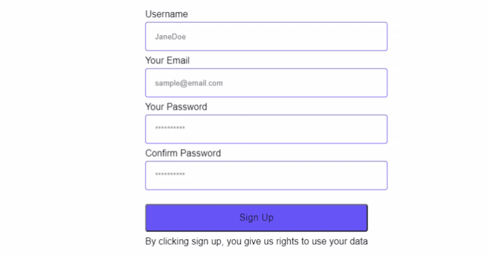
DISPLAYING OUR FORM IN THE BROWSER
Let's import the form into App.js and see how it looks. in App.js
import { SignUpForm } from "./components/signup/SignUpForm"

function App() {
  return (
    <div className="App">
     <SignUpForm/>
    </div>
  );
}
ADDING A TOUCH TO OUR FORM
We can go one step further and add an animation to our form that takes effect if it fails any validation. Add the CSS for shake animation
.animated {
  -webkit-animation-duration: 1s;
  animation-duration: 1s;
  -webkit-animation-fill-mode: both;
  animation-fill-mode: both;
}

@-webkit-keyframes shake {
  from, to {
    -webkit-transform: translate3d(0, 0, 0);
    transform: translate3d(0, 0, 0);
  }

  10%, 30%, 50%, 70%, 90% {
    -webkit-transform: translate3d(-10px, 0, 0);
    transform: translate3d(-10px, 0, 0);
  }

  20%, 40%, 60%, 80% {
    -webkit-transform: translate3d(10px, 0, 0);
    transform: translate3d(10px, 0, 0);
  }
}

@keyframes shake {
  from, to {
    -webkit-transform: translate3d(0, 0, 0);
    transform: translate3d(0, 0, 0);
  }

  10%, 30%, 50%, 70%, 90% {
    -webkit-transform: translate3d(-10px, 0, 0);
    transform: translate3d(-10px, 0, 0);
  }

  20%, 40%, 60%, 80% {
    -webkit-transform: translate3d(10px, 0, 0);
    transform: translate3d(10px, 0, 0);
  }
}

.shake {
  -webkit-animation-name: shake;
  animation-name: shake;
}
Now , add the class to the input but activating it only if the field has been visited and there is a validation error
const FormInput = ({
  name,
  labelName,
  placeholder,
  type,
  onChange,
  onBlur,
  value,
  errors,
  touched,
}) => {
  return (
    <div className={styles.inputWrapper}>
      <label classname={styles.label} htmlFor={name}>{labelName}</label>
      <input className = {errors && touched ? `${styles.animated} ${styles.shake} ${styles.input}`:styles.input}
        placeholder={placeholder}
        type={type}
        id={name}
        name={name}
        onChange={onChange}
        onBlur={onBlur}
        value={value}

      />
    </div>
  );
};

CONCLUSION
That will be all, some couple of things we can improve on:
- Our code is cluttered in a single place at the moment, we can seperate them into Modules
- Add axios or node-fetch to handle submitting the content of our form to a server and then displaying errors from the server
- validating from the server before the user taps enter button.
You can fork the project from this repo and play around with it. I am on Twitter and github. You an contact me here. Thank you for your time.